Reading the results
After the chatbot has served variants and sent thumbs_up events, open the results page for math-bot-system-prompt-v2.
This page answers one question: did the step-by-step prompt perform better than the direct-answer prompt?
Summary cards
At the top, the page shows the experiment summary:
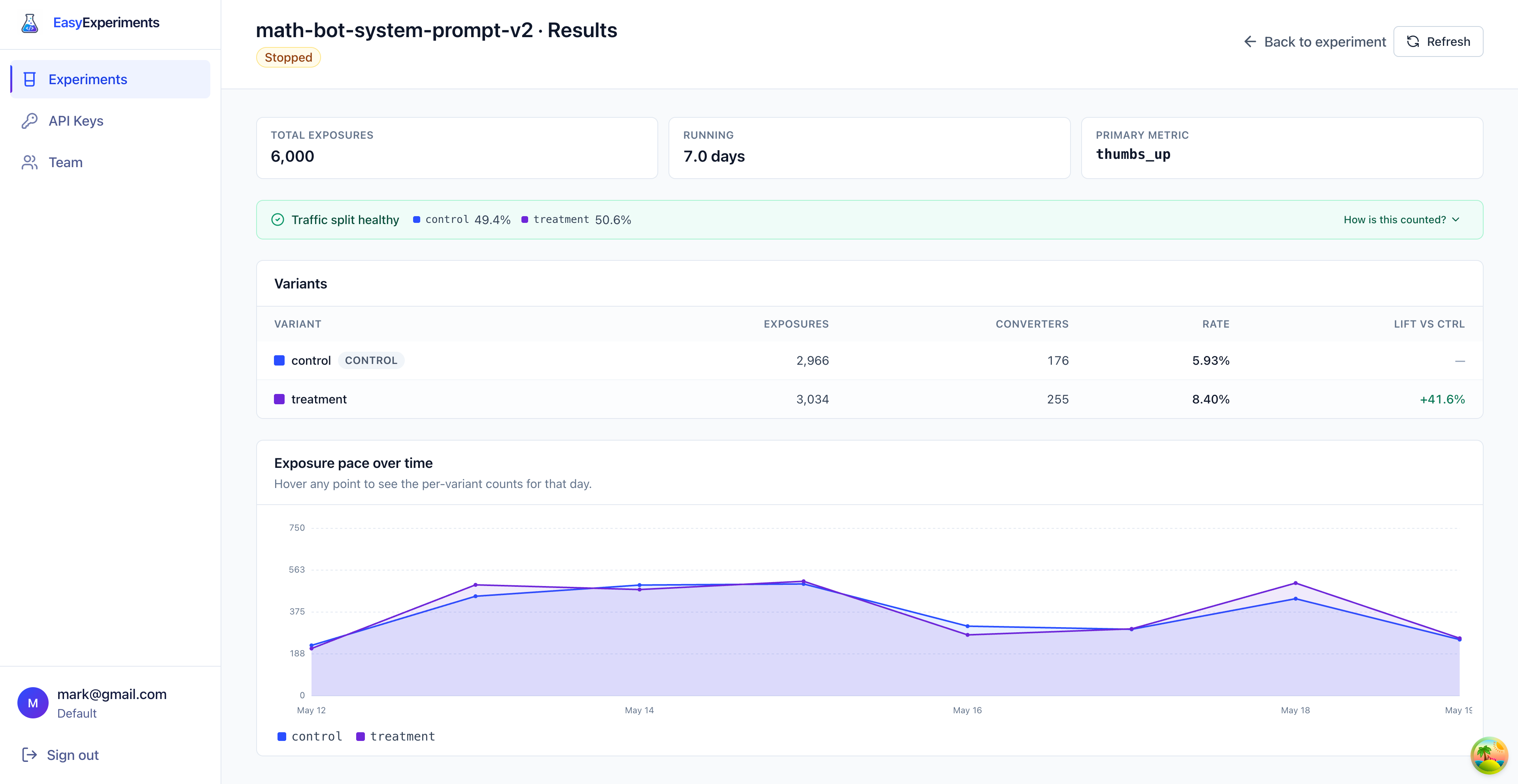
- Total exposures:
6,000users entered the experiment - Running:
7.0 daysof collected data - Primary metric:
thumbs_up
An exposure means Easy Experiments returned a real variant for a user. If the same user asks multiple questions, they still count as one exposed user for that variant.
Traffic split
The green banner says Traffic split healthy.
In this experiment, the segment was configured as a 50/50 split:
control:49.4%treatment:50.6%
That is close enough to the expected split, so the comparison is trustworthy. If one variant received much more traffic than expected, the page would warn about a sample ratio mismatch (SRM): the actual split is too far from the configured split for the difference to be random noise. SRM usually points at a bug in how the experiment was wired up, not a real result, so the rest of the numbers should not be trusted until it is fixed.
Variant table
The table is the main result.
Here is how to read it:
- Exposures are users who received that variant.
- Converters are exposed users who later sent the
thumbs_upevent. - Rate is converters divided by exposures.
- Lift vs ctrl shows how much better or worse a variant is compared with the control.
For treatment, the rate is 255 / 3,034 = 8.40%. For control, the rate is 176 / 2,966 = 5.93%.
The lift is the difference between those rates, compared with the control rate. In this case, treatment is +41.6% higher than control.
Exposure pace
The chart shows how traffic arrived over time.
Each line is one variant. The lines are close together, which is another good sign: both variants received traffic at a similar pace during the experiment.
Use this chart to spot obvious problems, like one variant suddenly receiving no traffic, or a big traffic spike that only affects one variant.
How counting works
Easy Experiments joins two things:
- the variant each user received from
evaluate - the events that same user later sent to
track
For the primary metric, the service counts users, not clicks. If the same user sends thumbs_up more than once, they still count as one converter for the conversion rate.
The important rule is the same as before: use the same entityId in evaluate and track. That is how Easy Experiments knows which variant caused which result.
Conclusion
In this example, the treatment prompt is the clear winner.
The step-by-step prompt received similar traffic to the control, converted more users, and lifted the thumbs_up rate from 5.93% to 8.40%.
If this were our real math chatbot, the next step would be to ship the treatment prompt, then keep watching cost and quality metrics to make sure the better answers are worth any extra model usage.